Design Process
Design Process:
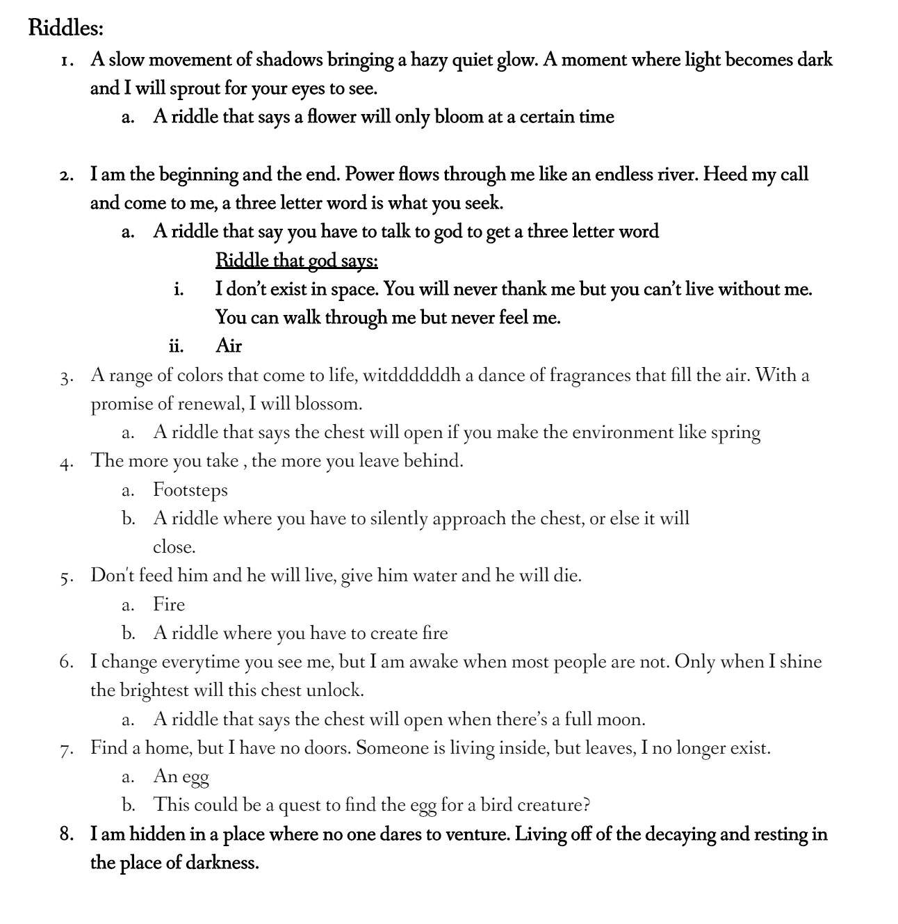
For our design process we mainly started out by looking for inspirations such as Oxenfree and Labyrinth. We started out by discussing the genre we wanted the game to be aside from Adventure, deciding on wanting to include puzzles, narrative, and fantasy. From then on, we discussed what we wanted the layout of our game to look like, and started to think about what our narrative should be. We wanted our puzzles to be riddles and for our first prototype decided on what three riddles we wanted our player to solve in the game and went to see if players could solve them. Afterwards we continued to develop the movement of our player, as well as the environment and dialogue.
Character Design:
I designed the main character according to the constraint of mobile screen size that has super deformed shape in order to make the head stand out. Due to the theme of fantasy, we wanted to create the character as a non-human character. Therefore, we created the elf character, however, since the character was too small on the phone, play-testers did not know the main character was the elf. I built the character in Maya and colored it in Mudbox.

Environment Design:
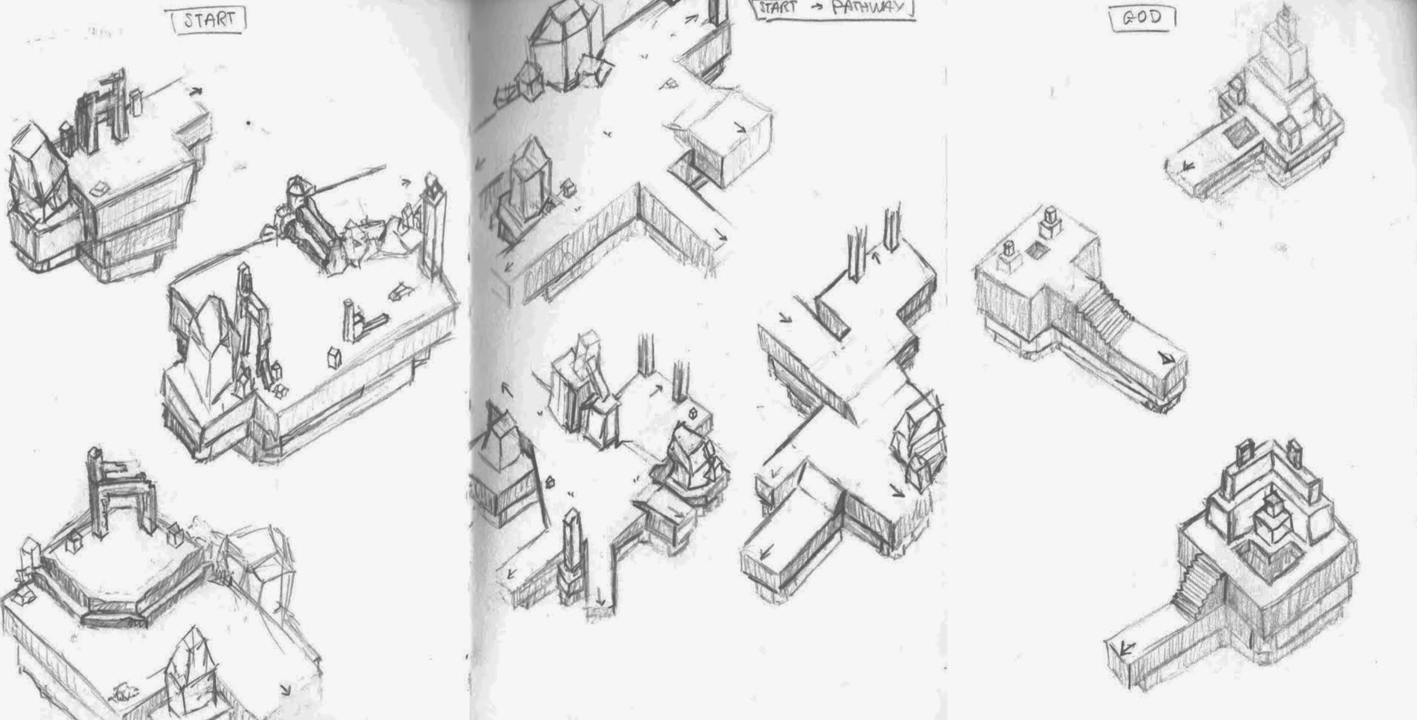
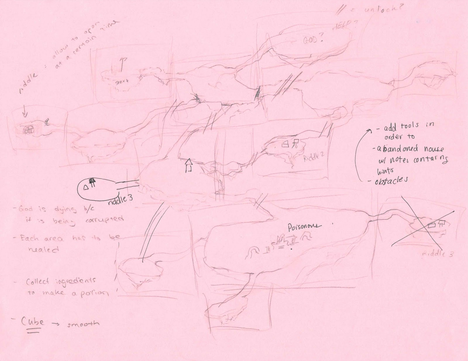
Starting with the environment design, we sketched out a quick map to figure out how we wanted our work to look and we also discussed the placement of objects in order to figure out how a player would traverse our world. Looking into how we can make our player backtrack. After figuring out the placement of where each island or area would be and how they are connected, we moved on to the visualization of the environment. With the thought of mobile, we knew we wanted to keep the shapes and form rather low poly. The platforms, rocks, plaques, and ruins where created with cubes in contrast to the vines which were modeled in Maya. As the player gets deeper into the forest we wanted the vines to grow more thick as a visual signal of the player getting closer to the source. We also used different layers of fog and trees to create depth and make these platforms seem as if they are in the sky. We also put our camera in an isometric view in order to better show the depth and space of our environment.
UI Design:
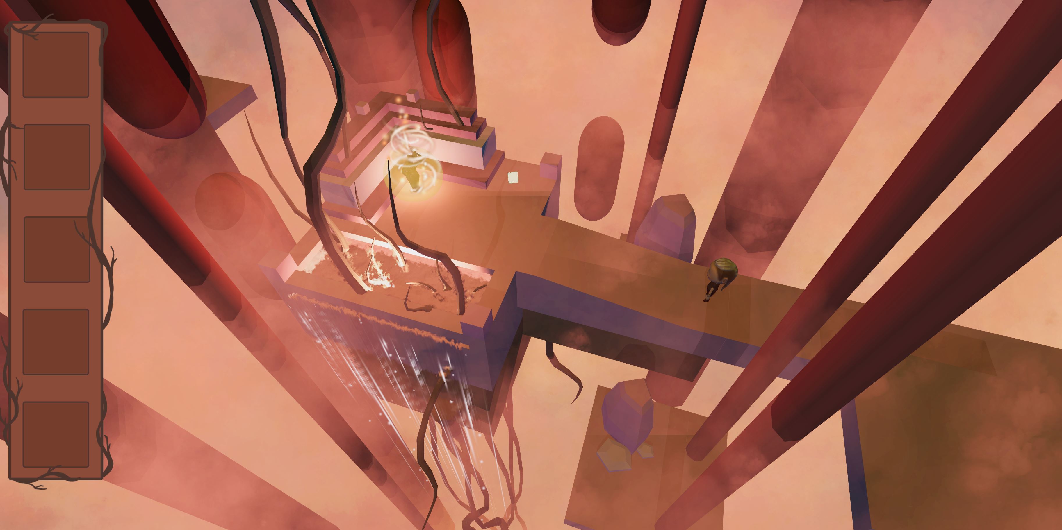
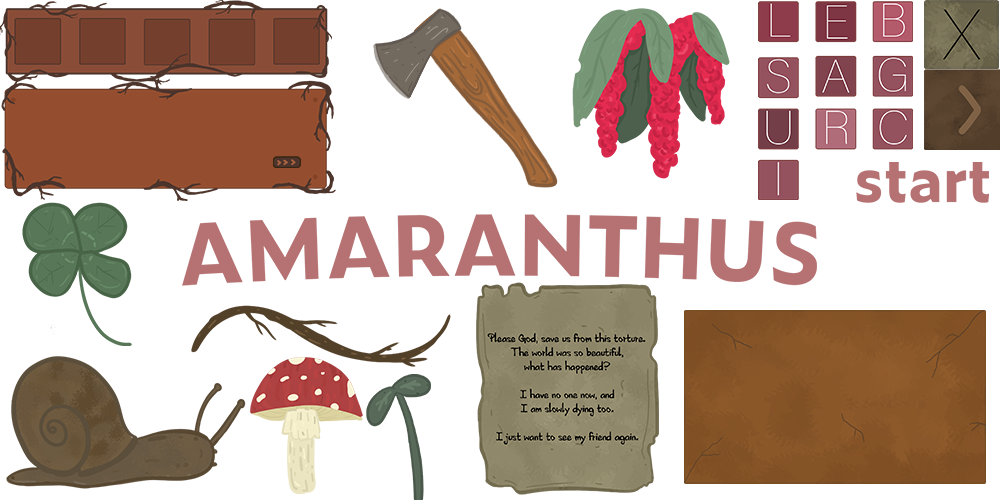
When thinking through the UI design, we wanted it to incorporate the environment with it. This is because the world itself is being poisoned and taken over by these vines and we wanted to use the imagery of vines wrapping around the inventory box and dialogue box to make it feel more cohesive. Furthermore, the plaque UI, we added a little bit more detail such as cracks and a texture to the box image was to suggest the imagery of stone but more stylized rather than realistic to be cohesive with the art throughout the game. Moreover, the colors were planned to be muted earth tones. Although the world is mainly red and purples, the muted warm tones of the UI were to stand out a bit from the environment but still allow the colors to compliment each other in the game.
Playtests:
OUR THOUGHTS :
- Thought you needed to go to start (particle system)
- Main pathway ****connection issues
- Turn contrast up
- More shadow specifically on the character
- Make collider bigger
- Make everything bigger
- Chest riddle collider issue (can't go back)
- God scene issue with collider and text box
CINDY:
- Particle effect of where you are tapping
- Walk faster
- Can't read the plaque again
- Button ui in the chest riddle scene
- Bright color of what you tapped
- GodRiddleTest button, have text appear faster
- Didn't know it was a chest
- MainPathway connection path other
- Make story more clear
- Test is too small
- Make a the riddle a bit clearer
- Got the riddle
ZACH:
- Didn't see himself
- didn't see plaque
- can't stop walking make it more responsive
- navigation is confusing
- make music quieter
- got the riddle
ANSHUMAN:
- Liked the environment
- Wanted to fall off
- Was confused on navigation (how to move at first)
- Didn't know/didn't understand the connection between the riddle
- Didn't know what to do after reading the plaque (make it a bit more strait forward)
- Maybe make it so that you go to the chest first before the plaque
- Hard to see text
- Got the riddle
YEJOON
- On the level start scene, it is hard to know where is the quest box due to the dark and red tint of the background
- It is hard to know where to go and what to do. Maybe it will be better to have arrow indication that teaches the player where to go
- The speed of the player is little bit slow
- The character seems too small and does not stand out. Perhaps, use contrast color for the player from the background
- Objectives do not stand out compared to map
- It would be interesting to have different characteristics of the pathway. Maybe signs with abstract names that hint the scene
- Dialogue is hard to read on the god scene
Get Amaranthus
Amaranthus
| Status | Released |
| Authors | Nicole Polidore, JustinaY, ysong |
More posts
- PostmortemMar 11, 2020
Leave a comment
Log in with itch.io to leave a comment.